Tuesday, March 30, 2010

Weighty Matters by Cornish Heritage Farms


How cute is this little pup?!?  Weighty Matters is a new Saturday Evening Post collection release by Cornish Heritage Farms, available today.  It has two very fun images, along with a range of sentiments for a bunch of different possibilities.  For this card, I used Cosmo Cricket papers to come up with a little weight watcher's encouragement card....  so important to have encouragement from friends and family when you're trying to lose weight!

For this next little circle card, I stamped the same image and used  Nestabilities scalloped circle dies to cut out and frame the image and to make the card base (just overlapped the fold a bit at the top, then punched a hole for the ribbon to go through).  The paw print and sentiment are from Mona Lisa Moments' Doggie Expressions set.

This last card uses the second image in the set... which is just too funny!  I figured this image would be perfect as a little note of apology for an oversight or forgetfulness (that's me, LOL).... an "oops!" card.  The paper and letters for this one are K and Company.
For more inspiration and lots more different looks for this set, check out what the design team have posted in the gallery

Monday, March 29, 2010

Gingersnap Postcard Art Swap

I recently participated in Gingersnap Creations' first art swap - a 4 for 4 postcard swap. Our theme was "Party" in honor of the Gingersnap Creations blog's 1-year birthday.  My little card featured the "Party Hat" stamp from Stampington.  I colored her with Copics, cut her out, and adhered her to my background.  For the background I layered several other festive stamps (Stampington, Inkadinkado), along with a strip of vintage sheet music and some vintage pleated pink trim. The sentiment is computer-generated.

This was my very first art swap by mail... the only other thing I've ever swapped is ATCs with my local club, so this was a new experience for me.  Let me tell you... I am so thrilled with the fabulous art I've received in this swap!  I will definitely do it again.  Many thanks to Shar, Ali, Debby, and Gerrie, whose postcards I received.  These women are fabulously talented, and I will always treasure their beautiful art.  Thanks so much ladies!  

Sunday, March 28, 2010

An Easter Basket for the Shabby Tea Room Challenge

It's Week #2 of challenges at a fabulous new blog, The Shabby Tea Room.  This week's challenge was to create a card or project that is "Spring Inspired - With Stitching." Well, with Easter right around the corner, I couldn't help but use my all-time favorite bunny stamp, "Easter Basket" from Cornish Heritage Farms.  And since the challenge required stitching, I decided it would be a good time to pull out some Claudine Hellmuth Sticky Back Canvas and have a go at coloring it with Copics.   This technique produces a wonderfully soft, faded (could we say "shabby"?) effect.  I zigzag stitched around the image, then used multiple strips of Kioshi patterned paper (just like my last post) to create an Easter-colored background, which I straight-stitched along the edges.  A little Martha ribbon and some hydrangea blossoms were enough to accent this sweet bun-bun.  Have a beautiful Palm Sunday, and happy crafting!

Saturday, March 27, 2010

Stamping Around SA05 Inspiration Challenge

I just love, love, love photo inspiration challenges.  I made this card for Stamping Around's SA05 Waltzingmouse Inspiration Challenge.  To the right is the fabulously inspiring photo from Anya.  It makes me want to have a glorious spring brunch with all the fine china.  Actually, it makes me want to hit the flea markets and find lots of shabby chic, mismatched china pieces to add to my collection!  For my focal image, I used the Freesia stamp from Cornish Heritage Farms, a sentiment from Studio G, and Memento inks and coordinating markers.  I colored some Hero Arts Art Flowers with the Memento markers to get a good match.  The background papers are from Basic Grey's Wisteria and Kioshi collections - cut into strips and stitched on, then shabby-ed up and distressed with Distress Ink in milled lavender, antique linen, and dusty concord.  I added a little aqua tulle for some extra springy-ness, and to echo the blue ribbon on the package.  This challenge was loads of fun.  Hope you're having a happy weekend!

A Little Bird Told Me

Happy Bird-day to You!  This little card was made with Oxford Impressions' "The Bird's Nest" plate in honor of the birthday of Oxford Impressions' founding femme, Suzanne Melvin. Suzanne is offering a wonderful gift to her customers..... send her a birthday card by March 31st, and you will get a coupon code for 20% off your order.  But it has to be a real card, as in, go through the mail! I found out about this offer recently from Lynn Stevens' blog.  Since I'm in NC and Suzanne's in TN, I think (hope!) it'll make it.  So for you folks who are in the neighborhood (as in, say... eastern US) you can probably get it there, too.  You can get the details on Suzanne's blog here (most recent post) and here (the detailed how-to's).  So far, this is my only Oxford Impressions stamp set, but I have a "wish list" about a mile long, LOL!!  Hope you can join in!

Thursday, March 25, 2010

The Play Date Cafe Challenge #22

I have the privilege once again this week of being a guest designer for The Play Date Cafe.  This week's Creativity Challenge #22 uses the colors of sky blue, rosy burgundy, and taupe.  Now I have to admit, when I first saw this challenge, I thought," Taupe?  I don't know that I have any taupe."  Ah, but once I started digging through my stash of stuff, I found lots of it!!  It is very common in vintage and shabby chic styles of paper and ephemera.  This first card is a tri-fold type of card.  I found two little bits that had all three challenge colors in them.... a little German scrap bluebird, and a little reproduction birthday postcard from one of the Making Memories Vintage Findings kits.  I went from there, using patterned papers from Basic Grey's Wisteria collection (the blue/taupe) and Die Cuts with a View's Mariposa mat stack (from which I cut the curvy taupe part).  The posy is from Prima, and the words are cut from Crafty Secrets' Altered Fairy scrap.  The stamps are from PSX and Stampin' Up.  Here's another picture with the card opened up on one side.
So in my initial hunt for taupe, I had gathered so many colorful little pieces that fit the challenge, I went ahead and made another card.  For this one I wanted to try to stick with the travel theme that is suggested in the challenge photo.  
Once again, I used some patterned paper from the Mariposa stack from Die Cuts With A View.  The center bluebird piece (all three colors again!) is from Melody Ross's Urban Chic collection, and on the right-hand side is a tag from 7 Gypsies that I punched and stamped.  On the left is a little piece of ephemera from one of the Making Memories Vintage Findings kits.  The red and blue weren't exactly the right colors for the challenge, so I scanned the piece, reduced it in size, and fussed around with the color until I got what I wanted.  I know very little about this sort of color alteration in Paint Shop Pro.... I just play!!  I added a few more little bits and a little stamping.

I hope you'll give the challenge a try.... the design team has once again created some awesome inspiration pieces.  You can check it all out at The Play Date Cafe.  Thanks again to Julie, for giving me the privilege of guest designing this month!!  I've had tons of fun!

Wednesday, March 24, 2010

Show Us How You've Grown....

.....more precisely, how you can incorporate "Growth" into a project for the new Gingersnap Creations Random Redhead Challenge.  As always, Gingersnap challenges are wide open for interpretation!  Your piece could be inspired by Spring and new growth, personal growth, or growth in your family.  Anything grows.... I mean goes. (I can hear you groaning.... ugh.... again... make me stop!).  For my card, I used an image from Tin Can Mail (Inkadinkado), stamped in a sepia tone and colored with Copics to make it look like a faded old photo.  The sentiment is from Close To My Heart.  Hope you'll be able to join us and play along... you've got until April 25th to enter!!

Tag Tuesday - Black and White

Tag Tuesday Challenge #44 at Kard Krazy this week is to use only black and white on a tag.  Here is the portrait of Crown Prince Peter von Cottontaille.  Yes, it's late.  No, I (hopefully) haven't totally lost my marbles.  I just couldn't help myself.  The darling bunny is from Cornish Heritage Farms.  The frame is Anna Griffin, and the crown is Crafty Secrets.  The lovely landscape painting in the background, which I have unforgivably altered, is by a British artist whose name I've lost.  Okay...  yes..... along with my marbles.  Have a wonderful Wednesday.

Edit:  Oh, I just found it.  The landscape is by Henry John Boddington.  Now about those marbles......

Tuesday, March 23, 2010

Dragonfly Release Day

No, not real dragonflies, hee hee... It's release day at Cornish Heritage Farms, and this is a sample of a new set called Emerging Dragonfly from the Sara England Line.  These "Emerging" sets are new and are great for cardmakers - there's a larger feature image and a lovely sentiment and word stamps in each set, and some will include a little coordinating secondary image.  For my card, I "smooshed" a few Distress Ink colors onto my mat, then swirled the stamp around in them a bit before stamping on my cardstock.  I used the "Dream" stamp to make a little frame, and cut out just the first bit of the sentiment using a Nestie.  The background paper is from Basic Grey's Kioshi 6x6 pad.

Here's another card, which uses the little hibiscus image in the background.  You can see the entire sentiment in this one - I think it's a good one for a scrapbook page as well as a card.

As always, there's plenty of inspiration in the gallery..... you can see the design team's creations for Emerging Dragonfly HERE, and for Emerging Dolphin HERE.  There will be more "Emerging" sets, er, "emerging" in the coming months.  Hope you have a great day, and that you find time to get inky!

Sunday, March 21, 2010

Shabby Tea Room Inaugural Challenge

I found a brand new challenge blog a few days ago called The Shabby Tea Room.  It's headed up by a few gals that are in my neck of the woods (central North Carolina), and the inspiration is just leaping off the page over there!!  Their very first challenge is "Elegant Shabby" and is based on this picture, using colors of pink, cream, red, green, and brown.

For my card, I used some paper from the Mariposa collection by Die Cuts With A View as the focal point of the tag.  The other papers are from K and Company and My Mind's Eye.  The little flower chipboard piece is also from the Mariposa line.  All of the stamps used are from Cornish Heritage Farms: Vintage Butterflies, French Script Backgrounder, and Ornamental Beauty (sentiment).  The fabulous scrunchy seam binding is from Bluebird Lane Etsy shop.  I stitched, distressed, painted, sanded, glimmer misted, and inked 'til I got that shabby look I wanted - such fun!  If you like creating in this style, you'll definitely want to check out the samples and all the other submissions at The Shabby Tea Room.  One really cool thing..... everyone's linked project is shown as a thumbnail, so you get a little peek before you even visit their blogs.  That's new to me, and I love it!

Saturday, March 20, 2010

Tag Tuesday - It's Spring!

The challenge this week over at Kard Krazy's Tag Tuesday is Spring.  A welcome subject for most of us, I'm sure. :)  It's sunny and in the 70s here this weekend - perfectly spring!  For my tag I used a bird image from Crafty Secrets Bird Notes, colored with Copics.  The background music image is CHF's Aged Sheet Music Scrapblock.  I used a paperclip from Melody Ross's Homespun Chic collection, some more of that gorgeous Prima petal trim, a little label from 7 Gypsies, and some flowers I pulled off of a big box floral stem.  You'll want to check out all the other creations (Louise did a house-shaped tag!) - so inspiring, so much springy goodness! :)  Have a great Saturday!

Friday, March 19, 2010

Peacock Scene Backgrounder from Cornish Heritage Farms

Today Cornish Heritage Farms releases a fabulous new backgrounder called Peacock Scene.  This is one of those backgrounders that you'll want to showcase, it's so pretty - hard to cover it up and put it in the background. There are tons of fabulous examples from the design team in the gallery HERE - everyone sorta went wild with this one. :)

For my card, I did a resist technique, combining the Peacock Scene backgrounder with the French Script backgrounder.  So how about a little tutorial?

First, stamp the French Script back- grounder using dye ink (I used Memento Rich Cocoa) on ivory cardstock.  You will need to stamp it twice side-by-side.  Don't worry if it's not perfectly lined up, it won't be noticeable in the end anyway.


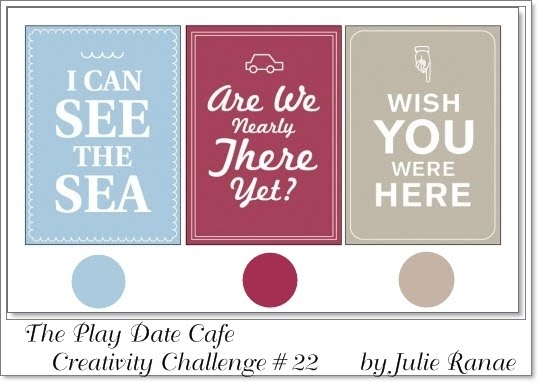
Next, stamp the Peacock Scene back- grounder over the top of the French Script image, using an embossing ink such as VersaMark.  Quickly pour a generous amount of clear embossing powder over the wet image, and tap around to get good coverage.  Gently bend the paper so that you can pour the excess embossing powder back into its container.  Heat emboss using a heat gun.


Now comes the fun part.  Gather up an assort- ment of dye inks - I used Ranger's Distress Inks in Broken China, Tumbled Glass, Faded Jeans, Crushed Olive, Peeled Paint, and Shabby Shutters.  With the lid still on the ink, push the lid down so that it touches the surface of the ink pad.  Take off the lid and you should be left with some pooling of ink on the lid.  This is your paint palette. :)  

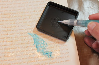
Use a brush dipped in a little water, or an aqua painter brush to lift some ink off and paint in the areas of the image that are not embossed.  Use good lighting and have the picture of the image that comes with the stamp handy to get an idea of where you want to put each color.  However, don't be too worried about getting color in an exact spot - this technique is very free form and watercolor-like.


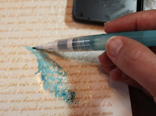
When you are done painting, gently go over the entire surface with a damp paper towel, to remove the ink from the embossed areas.


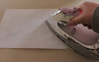
Next, layer a few pieces of scrap printer paper over the top of your image, and use a hot dry iron (no steam) to iron over the top of the printer paper.  This will melt the clear embossing powder, which will stick to the printer paper and leave your image much less glossy.  You may need to use an additional sheet after the first one, depending on how thick your embossing is.


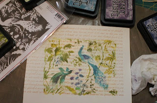
Here's a picture of my finished image.


I cut the image down a bit to fit on a standard sized card.  I wanted to add a few photo corners for accent, but didn't have any good colors.  Copics to the rescue!  I got out my white photo corners and colored them using a coordinating Copic.  Then I adhered everything to the card base, and left it at that.  You could also add some pretty flowers, but I just couldn't decide where to put them, so I left them off, LOL!


Have a great weekend everyone, and thanks for stopping by!

Thursday, March 18, 2010

Play Date Cafe Challenge #21

This is a big week at The Play Date Cafe - it's the first week of challenges with their new design team!! Congrats to all the fabulous artists joining the Cafe!  Each and every one of these ladies is wonderfully talented, and will be offering us tons of inspiration in the coming months.  I am also extra excited about the challenge this week because I get to be a guest designer!  Julie asked me to play along with them for this beautiful color combo: medium pink, pale pink, and pale yellow.  These colors are absolutely perfect for spring cards and projects.  For my card, I used K and Company's Cut and Paste paper pad, along with a butterfly transparency from Melody Ross's Homespun Chic collection.  The flowers are Prima, the sentiment is from Stampin' Up!, and the pleated trim is a vintage find.  I added a little Distress Ink here and there, a Stampington vintage label image in the background, and some Dazzling Diamonds on the butterfly. 

Here's a little tip you may want to think about, should you ever find yourself without the right color of cardstock.  I didn't have the perfect color pink cardstock for this card - none of my pinks was right with the K and Co. paper.  So I took a Copic marker and added color to the edges of a paler pink cardstock panel that I used to frame the images.  I often use my colored cardstock as a frame only, and adhere the layers to an ivory or white card base, which is what I did here.  So the only areas I needed to color were the very edges (1/8 inch all around).  The color isn't perfectly uniform, but that's okay, since my card has a vintage look to it anyway.  It's a good little trick to use if you're in a pinch.

You'll want to be sure and check out all of the new design team's creations, and try your own hand at this fun color scheme.  Be sure to link up your art at The Play Date Cafe.  Thanks for stopping by!

Tuesday, March 16, 2010

The Wheel Thing from Cornish Heritage Farms

I created this card using a totally fun and whimsical image from The Wheel Thing stamp set, releasing today from Cornish Heritage Farms.  It's part of their Rummage Bin collection of fabulous vintage sets.  For this card, I colored the image with Copics, and bordered it with some pretty spring papers from Cosmo Cricket's Earth Love line.  I added some Basic Grey stitched brads and velvet ribbon, reminiscent of the gents' fancy frocks. :)  The gallery at Cornish Heritage Farms has lots of gorgeous cards from the design team - you can check it out HERE.

I'm off to shop with my daughter... it's her 11th birthday today, so we're going to go empty out the tweenie/teenie shops at the mall with her birthday money (Aeropostale,  Hollister, Gap... and I'm hoping to convince her to give Anthropologie a try... for me.. :)).  Have a great Tuesday!

Monday, March 15, 2010

Tag Tuesday, on Monday

The theme for the next few hours (notice I can't say "week" since I'm so ridiculously late with this!) at Tag Tuesday is "Arches."  Could not for the life of me come up with anything for this challenge, until I decided to keep with the "Celebration" theme going on at Gingersnap Creations (Happy Birthday, Shar!), Artistic Outpost, and our own household, where my daughter will turn 11 tomorrow.  I made a glittery tag that I will be able to use on one of her little gifties. I went with the famous arch in the Eiffel Tower, along with an arch-shaped tag.  The Eiffel Tower image is from Itkupilli, printed out on vellum.  Behind the image is a piece of dictionary page with the word "celebrate" highlighted.  The fringe is recycled from a gift bag, and I added lots of bling for my daughter. :)

You can see lots of fabulous arch creations over at Kard Krazy.  And be sure to go on over to Gingersnap Creations for lots of celebration projects, ideas, and challenges, AND to wish founding femme Sharon Briss a Happy Birthday!

Sunday, March 14, 2010

Celebrate at Artistic Outpost

Gingersnap Creations is celebrating their first birthday this month (and it's also the birthday of one of their founding femmes, Sharon Briss)!  And, to help in the celebration, along with celebrating lots of birthdays of their own design team members, Artistic Outpost is having a special March Referral contest.  Use only your Artistic Outpost stamps to make a card with a Party and/or Celebration theme, and link up your post HERE.  They are giving away a very generous prize to one lucky participant.

Now, I don't have any AO stamp sets that specifically relate to celebrations, but that's okay... use your creativity and anything goes.  I used this adorable little boy from the Bluebird stamp set... doesn't he look like he's delivering a special birthday bouquet?  I stamped him in three different purple inks, then mounted the images on vellum, backed with white cardstock.  I added a label holder with the definition of "celebrate" cut out of a $1 dictionary I found at Target (no guilt cutting this one up, for sure!).  The lovely crinkled seam binding is from Bluebird Lane's shop on Etsy (no relation, LOL!!), and the vintage sheet music is from my stash.

So here's the weird thing, and maybe someone can help me with this.  See the text image used on the green card base?  What a devil of a time I had with THAT.... you see, I first stamped it using Milled Lavender Distress Ink.  I assembled my card, left for a bit to get my camera and fiddle around, and when I came back, the text images were GONE.  Vanished.  UGH.  So I took the darned thing apart, and stamped again using Memento dye ink.  What the heck?  The cardstock is from Stampin' Up!.  Can one of you lovely inky-expert ladies/gents shed some light?  Is there a way to prevent this, or at least to have a clue as to when it's going to happen (to save the trouble of disassembling cards)?  Perhaps the base cardstock needs a little tiny bit of coating/gloss to it, and SU!'s doesn't.  Mystery of the day, LOL!

I'm off to try to make a Tag Tuesday tag before the next Tuesday rolls around.... gotta find some more crafty time.  Take care, all!

Saturday, March 13, 2010

The Play Date Cafe Challenge #20

There's lots happening over at The Play Date Cafe this week.  They have announced the new design team members (congrats, Ladies!) and they are saying farewell to senior designer Julie Campbell, who is on to new pursuits.  Before she goes, however, she is giving us a wonderful challenge photo to inspire us this week.  I think this is my favorite yet!!  I pulled out more of my Basic Grey Kioshi paper (run, don't walk, to get this.... it's fabulous, IMHO) and a reeeeaaaally old Rubber Stampede lavender stamp.  Notice how the font for "lavender" is the same as in "The Play Date Cafe" on the picture?  *snort!* happy coincidence, tee hee....  Anyway, I colored the image with Copics, then finished off the card with some hardware from SU! to echo the enameled soap dish and the numbered wire basket, and also added some to-die-for trim from Prima.  To give the patterned papers a little more pop (since I didn't want to border them with cardstock), I went along the edges with coordinating colors of Distress Inks.  This technique just separates them from each other a little better I think, and eliminates the white edges.  It's all mounted on an ivory cardstock base.

Hope you're having a great weekend.  I'm playing around with this color combo some more, for a fun challenge going on now at the Artistic Outpost.  Hopefully I'll get that posted tomorrow with more details.  BBFN!

Friday, March 12, 2010

It's the Wheel Thing


A quick little sneak peek of a fabulous new set releasing from the Rummage Bin Line at Cornish Heritage Farms on March 16th.  Lots of fun, spring and summer bicycle scenes for feminine or masculine cards.  I couldn't help going all girlie with this one.

Hope you're having a great Friday!  Here's to a fabulous spring weekend!

Wednesday, March 10, 2010

Mmmmm... Frosting!

The new Spicy Supply Challenge over at Gingersnap Creations is up... and it's Frosting!  We are challenged to use anything that "makes the cake" on our creations - glitter, flower soft or flocking; beads, pearls or rhinestones; Stickles, crackle paint or Diamond Glaze.  I couldn't wait to dive into my new pack of Basic Grey's Kioshi patterned papers, and this one seemed perfect for adding some rhinestones to the centers of the flowers.  I used microbeads where I would normally use ribbon around the bottom of the card.  And of course, lots of Stickles and glitter (the glitter on the cupcake is glued on with liquid applique to give it some dimension).  That darling little fairy is an old PSX stamp (I miss them!), the cupcake is from Impression Obsession, and the sentiment is from Cornish Heritage Farms' Reach for the Stars set (Rummage Bin Collection).  I hope you'll play along!  And... don't forget about the Design Team Call - you have until Friday to enter.  If you always play along with their challenges anyway...... I'm just sayin'! :)

Monday, March 8, 2010

A Moonbeam Card for Play Date Cafe Challenge #19

 
This week's Play Date Cafe color challenge was a true challenge for me (and I can't say that about many colors - I love them all).  Yellow is a color I don't often use as the main focus of a card; however, once I found my main image, things came together a little more easily.  The colors for the challenge were deep yellow, pale yellow, and white.  My little moon-sitter is from the new Heartwarming Vintage "Altered Fairies" Creative Scraps..... loooooove them!  I knew I wanted to pair her with Cornish Heritage Farms' Astronomy Scrapblock, to give her a proper background.  The celestial image is stamped on some old Stampin' Up! patterned paper that had a yellow and white floral motif.  Then, since she was looking off to the side and smiling at something.... I needed to give her something to look at!  So I decided to go with yellow clip art butterflies, flying out of the flowers beneath her.  A bit of diamond Stickles touched everything with moonbeams.  Can you tell I ended up having fun with this challenge after all, LOL?  

A little reminder before you go..... if you'd like to try out for the Gingersnap Creations Design Team.... there's still time!!  Click on the Design Team Call badge in the column to the right for all the details.  I can tell you, it is soooo much fun to be on this team.  The gals are fabulous to work with, and I am in total awe of their work every day.  You'll know about the challenges well in advance, so there's no time pressure to get your projects completed (unless of course you're like me, and need two days to find your desktop before you start working, then lose the product you want to use, then stamp crooked, and then.... well, I still usually manage to get stuff done on time anyway, LOL!!).  Try it.  You'll like it.  :)

Sunday, March 7, 2010

Tag Tuesday - Brown + Color

Finally getting my Tag Tuesday Challenge #42 posted.... Louise challenged us to use brown plus another color.   The hardest part was picking the other color, since I LOVE to pair brown with just about anything, LOL!  I finally settled on blue, after getting in the mood for the sea with my Graphic 45 papers.  The "tag-on-the-tag" image is from their "On the Boardwalk" collection.  I colored the fab retro lady blue, and gave her a starfish.  The base tag is spritzed with Glimmer Mists, stamped with images from Stampington, Inkadinkado, and Stampabilities, and distressed with Distress Inks.  I added another little accent from the Graphic 45 paper, along with a few more seashells and some Distress Embossing Powder in antique linen to give the effect of sand. 

You'll want to head on over to Kard Krazy..... Louise's artwork is looking fabulous in the new Take Ten!  I am playing catch-up..... we've still got visitors, lots of activities, and I soooo want to visit everyone's wonderful blogs!  Tonight after everyone's in bed, I'm planning on playing with a few Gingersnap Creations challenges, some Playdate Cafe fun, and of course, I've got some new Cornish Heritage Farms to ink up.  So much crafty goodness to be had, so little time!! :)

Thursday, March 4, 2010

March Madness 3-Day Sale at Cornish Heritage Farms

 
It's been a crazy (but wonderful) week in our household.... On Tuesday, I got to attend a London Philharmonic Orchestra performance at a local university, featuring a phenomenal young violinist (Yossif Ivanov) AND my husband's uncle playing principal bassoon.  My son's hockey team won their tournament semi-finals game on Wednesday, and so they are playing in the finals on Friday night.  My mother-in-law is also arriving Friday from Buffalo.  My daughter is singing at school tonight.  And I have no time to craft!  Please bear with me during this week of sparse posts!  I will get into full swing.... sometime next week.
But in the mean time, I can give you a little enabling, in case you didn't already get some in the Cornish Heritage Farms newsletter.  Here are the details on a 3-day sale starting today:

This Thursday, Friday & Saturday (March 4th thru 6th) for every Backgounder or Scrapblock you purchase, you will get a second one of the same value for 1/2 price. So, say you purchase the Trees Backgrounder on Cling Cushion for $11.99 then you add the Paisley Backgrounder on Cling to your cart.  You will see (on the last page of the checkout before you finalize payment) $6 off your total. Add four and you will see $12 off, etc.

This is a great sale so don't miss out. Shop for all those Backgrounders & Scrapblocks that have been on your WishList for a while.
:-)   ONLINE orders only - no exceptions!  On the card above, I've used the Aged Sheet Music Scrapblock to make the patterned paper on the top.  I just LOVE the Scrapblocks because they are 6 x 6 - plenty big enough to make a card in either landscape or portrait orientation, plus you can easily align four stamped images on a 12 x 12 piece of cardstock to make your own patterned paper for scrapbooking.

Here's another card I made, using the Crossword Scrapblock.  I stamped it on several different patterned papers, then cut out sections of the crossword from each one, and pieced them back together.
 
It's time to slide on into the weekend.... hope everyone has a great one!

Tuesday, March 2, 2010

Another Train Map Sneak Peek

 
Here's another little peek at Cornish Heritage Farms' new Train Map Set coming Friday, March 5th from their B&O Railroad Museum line.  I actually cut into another piece of Graphic 45 paper (*gasp*) for the background and added a few stamped details of my own.  You can always do that with your patterned paper... add a little stamped sumthin'-sumthin' that totally ties it into your theme.  This is also my first use of Tim Holtz's Fragments - I am now hooked!  And there are so many in the package, I didn't even think about hoarding them!

Hope you're having a great week!  We're getting some more snow tonight.... here in North Carolina.... in March....?!?!?!?!?!?